
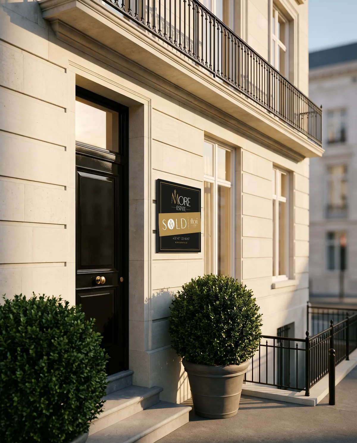
More than a sale. The identity of More Estate, carried from the facade to the hand: the sign on the street, the sticker that closes the deal, the card and the flyer.
Ground floor
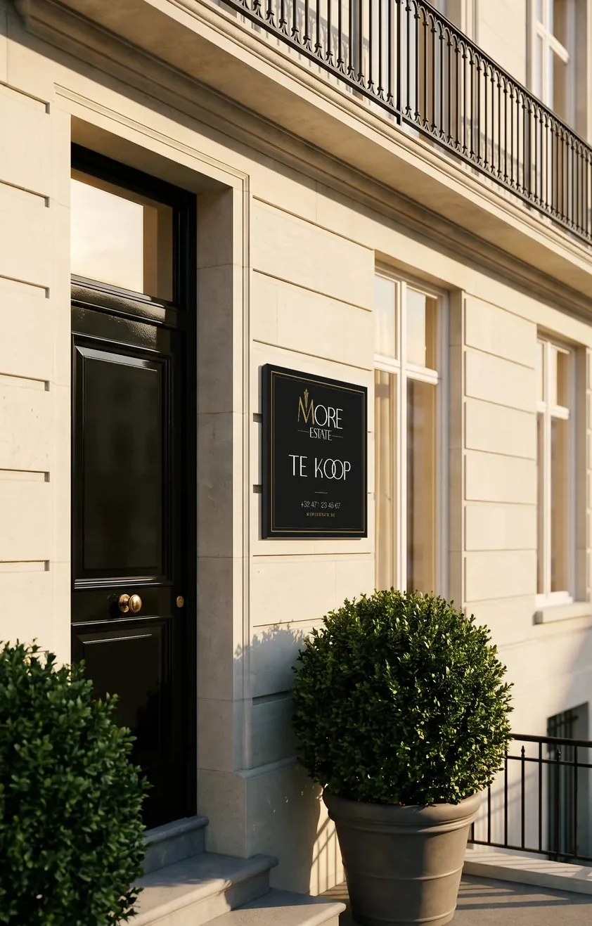
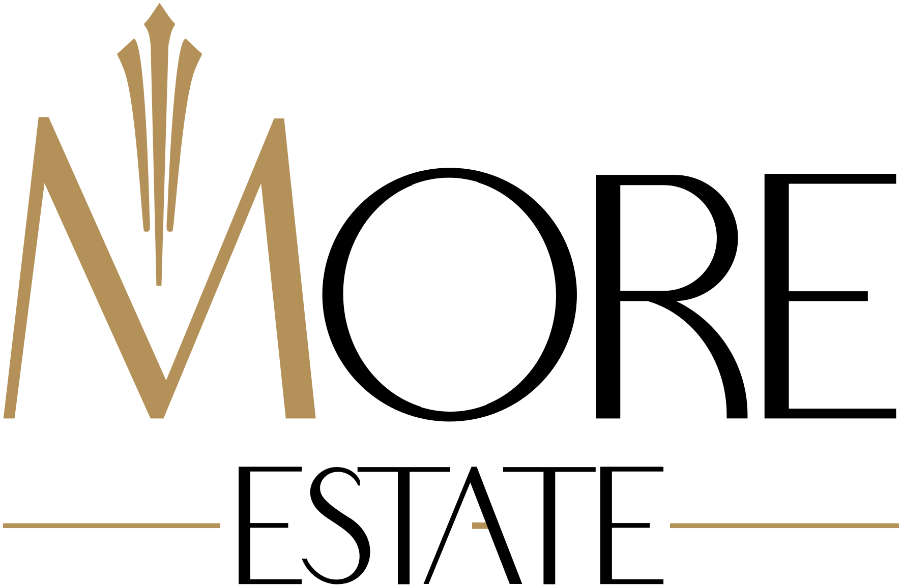
A monogram with a crown. The M rises into three slender gold blades above a wordmark drawn in the same fine Art Deco line.
Display · Boowie
Capitals only, for headlines and the words that must be read from across the street.
Text · Helvetica Neue
Real estate advisor
+32 471 23 45 67
For details, contacts and running text. Light, Roman and Medium.
Floor 1
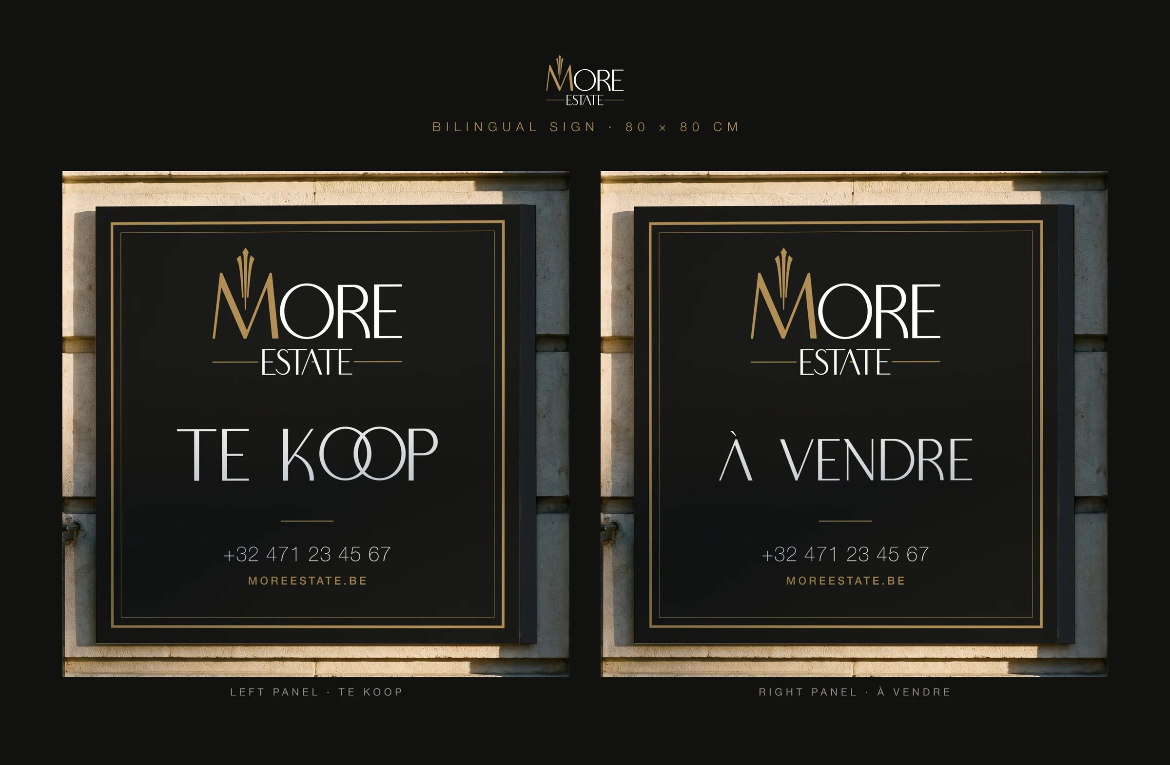
Made for Belgian streets.
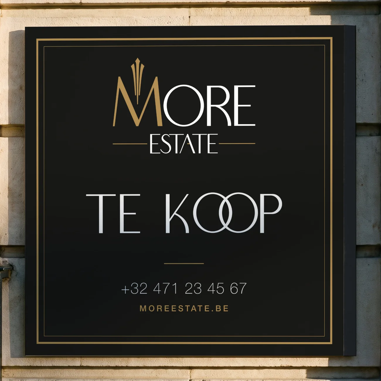
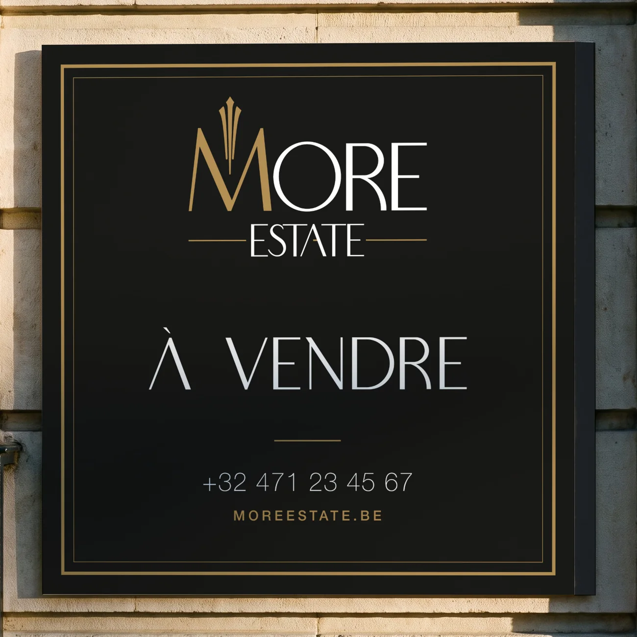
The bilingual sign speaks Dutch and French.
The Dutch version carries TE KOOP on both.
- Size
- 80 × 80 cm, per panel
- Versions
- Bilingual NL / FR and Dutch only
- Colour
- Black, gold and white, CMYK
- Text
- Boowie headline, Helvetica Neue details
Floor 2
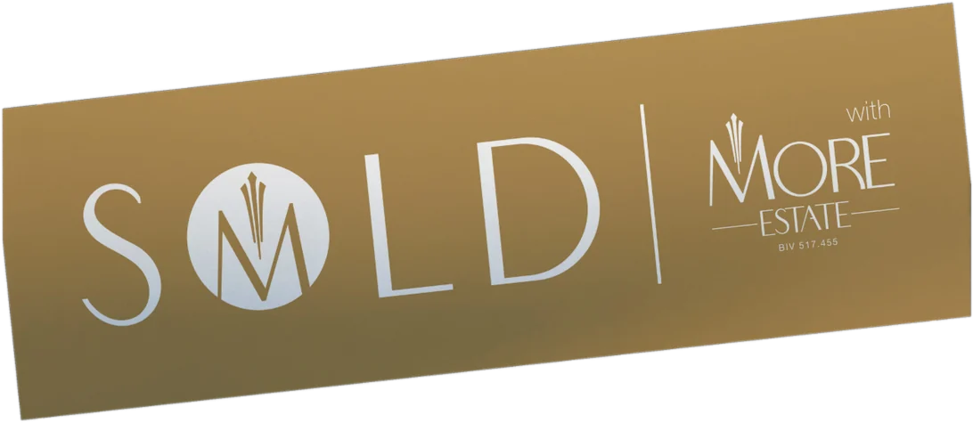
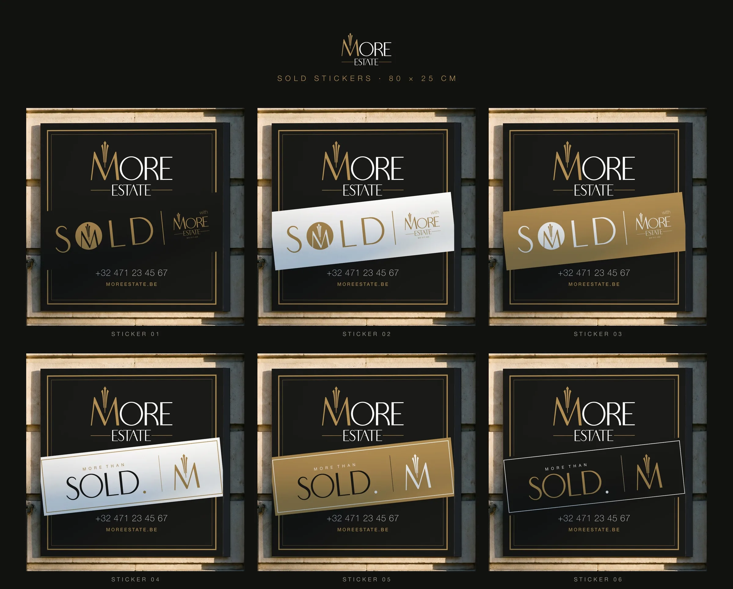
When the deal is closed, the sticker tells the whole street.
Six designs, each 80 × 25 cm, placed at a slight angle across the sign. Choose one and see it sold.
Floor 3
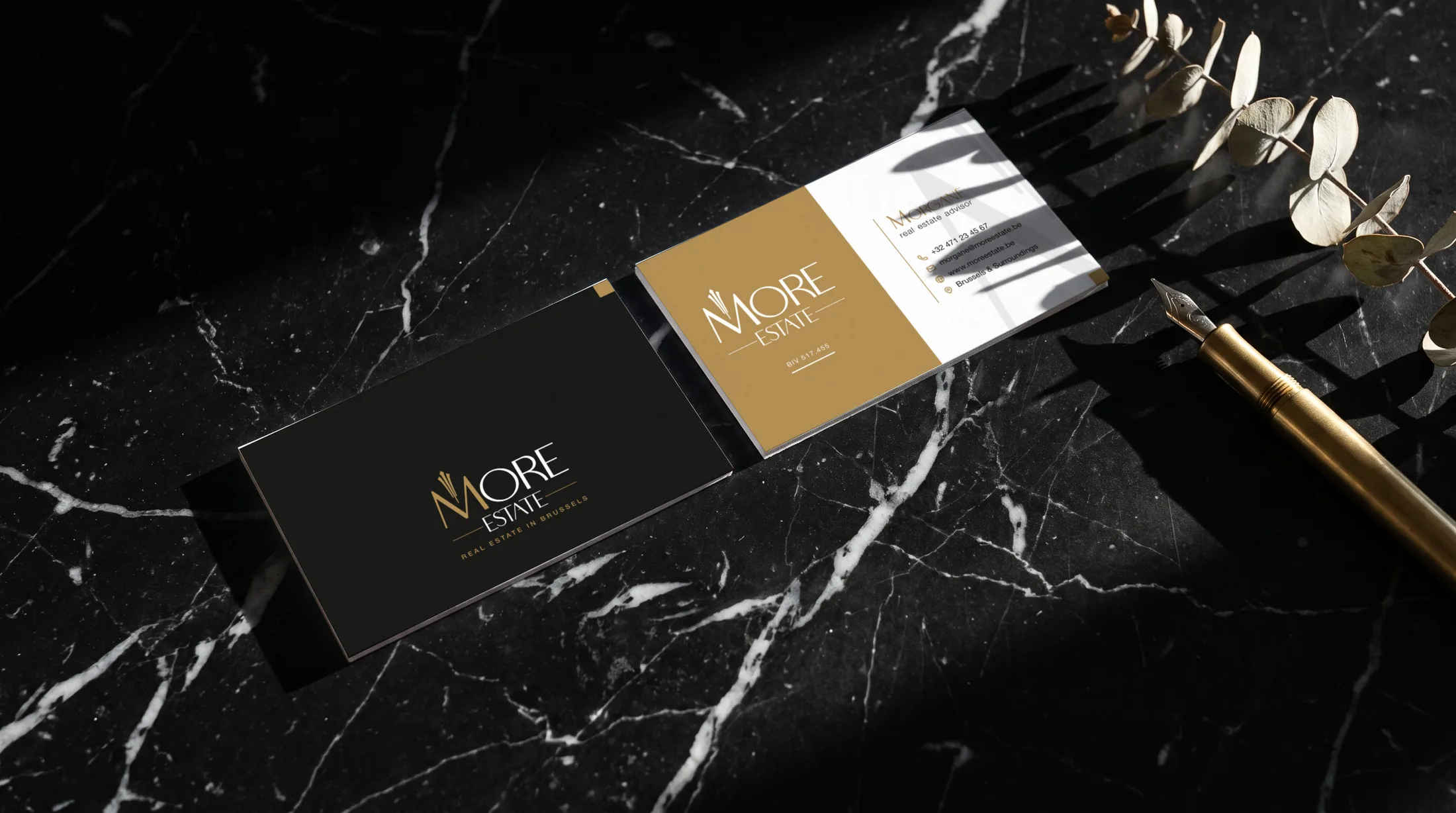
85 × 55 mm, printed on both sides. Gold and white carry the details, the black side carries the name.
Floor 4
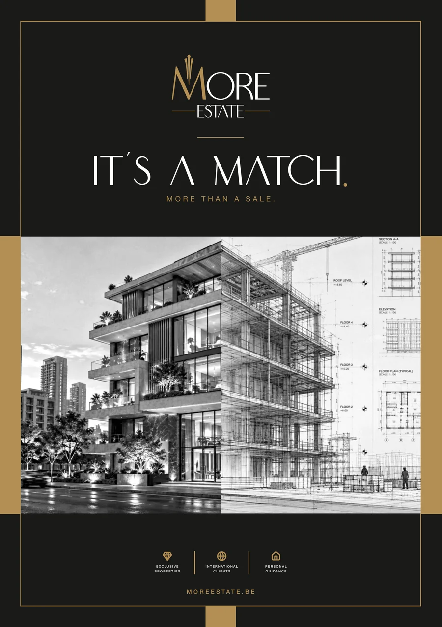
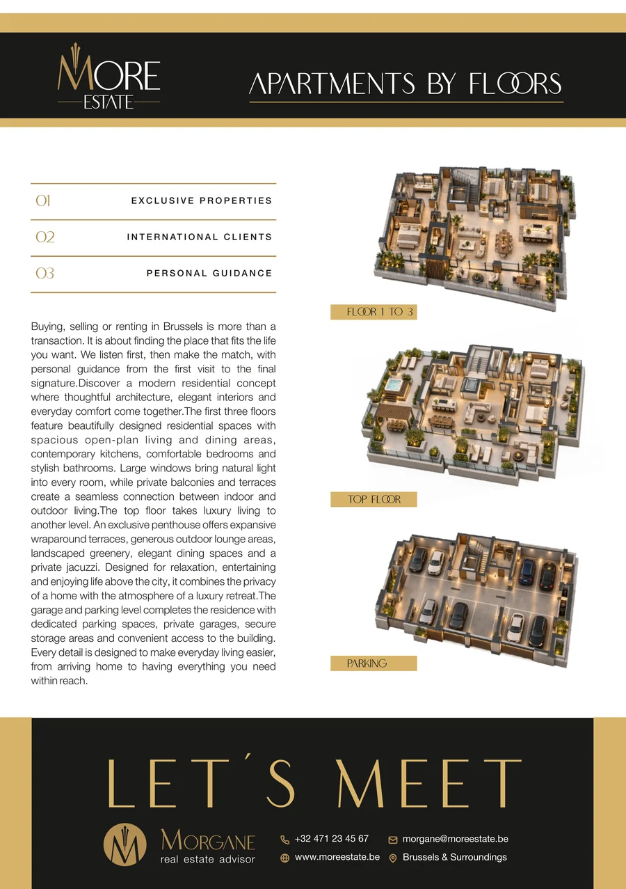
A5, printed on both sides. The front opens with the building. The back walks through it floor by floor and ends with an invitation.
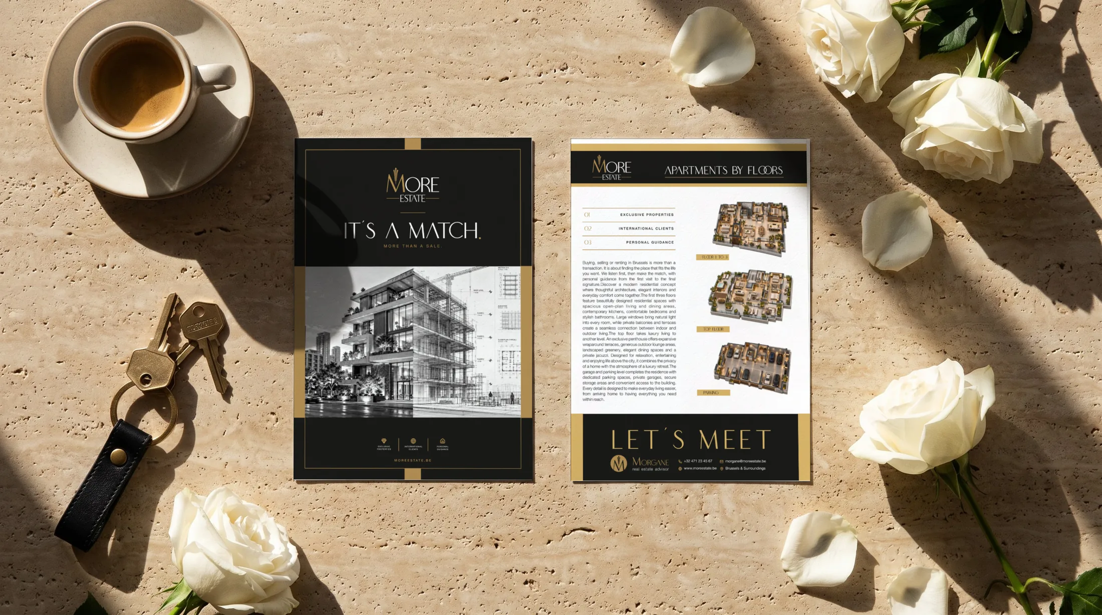
Penthouse
Everything together, the way
clients will meet it.

Every piece is ready for print in CMYK, with editable working files for each sign, sticker, card and flyer.